Click here to read the Spanish version.
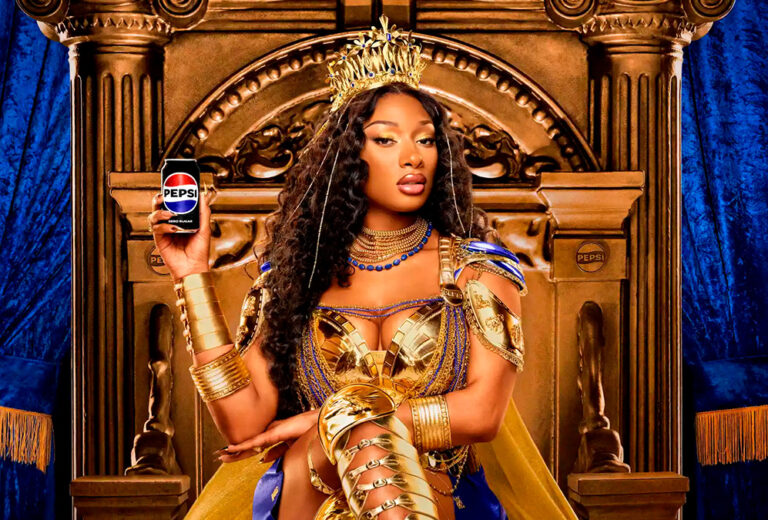
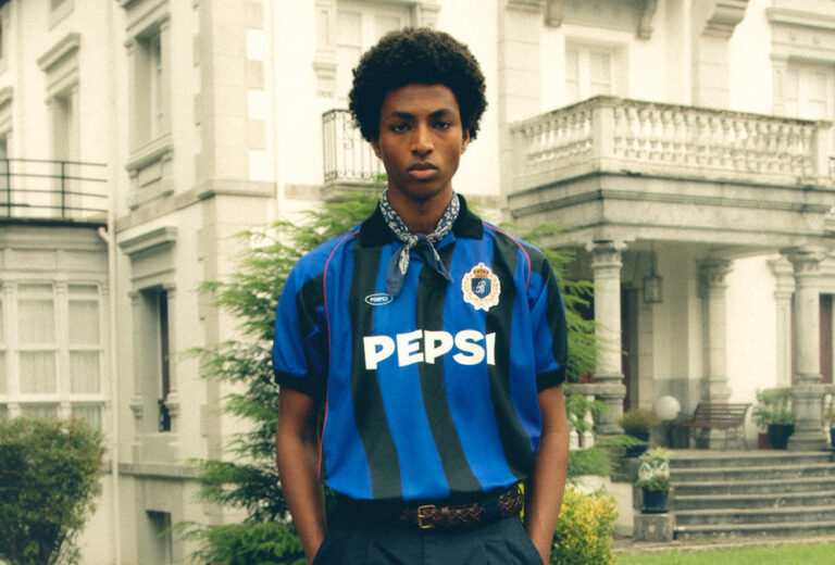
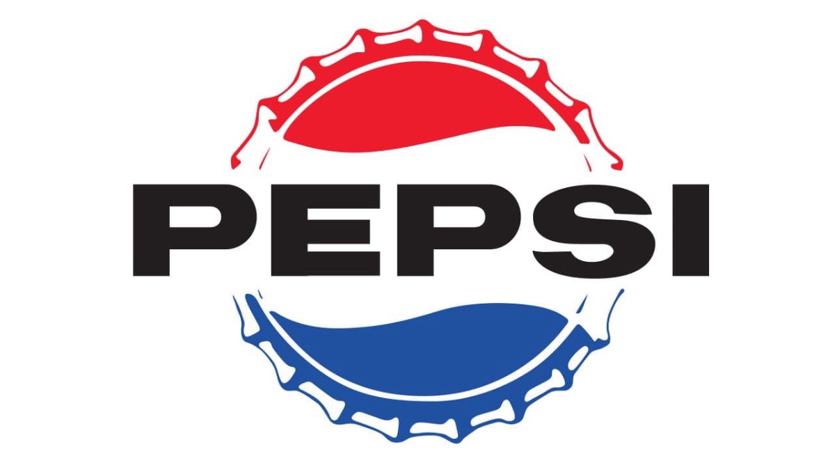
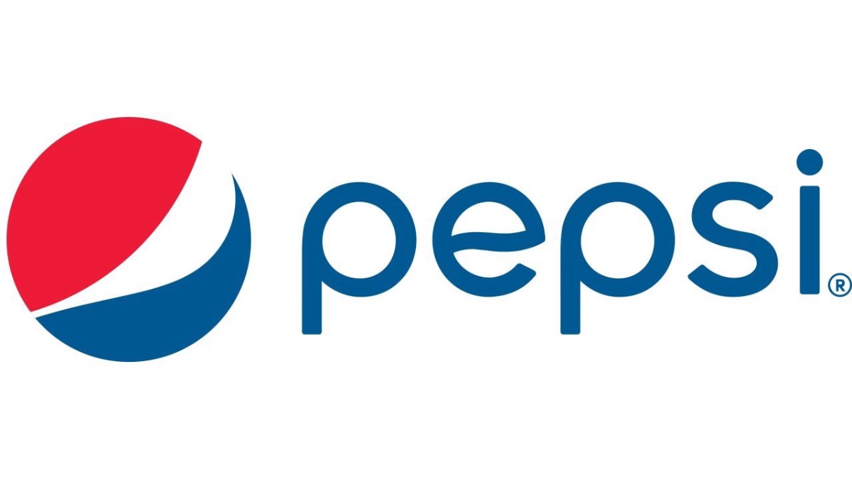
Pepsi has revamped its image by reintroducing its name inside its iconic red, white and blue dial and opting for a more modern typeface. This change in its visual identity is the first significant one in 15 years and will be officially launched in autumn in the United States and from 2024 for the rest of the world. In this way, Pepsi is returning to an image that it has used for much of its history (from the 1950s to the 1990s), but now it is doing so in a more modern way, thinking about the future, but maintaining its essence. Taking advantage of this change, we take a look at how the Pepsi logo has evolved since it was founded in 1893, first under the name Brad’s Drink.
1893 – 1898
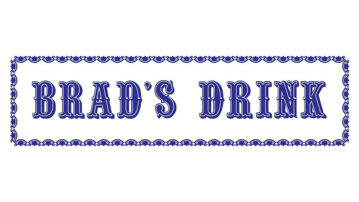
This was the name of the drinks brand founded by Caleb Bradshaw, which has nothing to do with the subsequent visual identity.
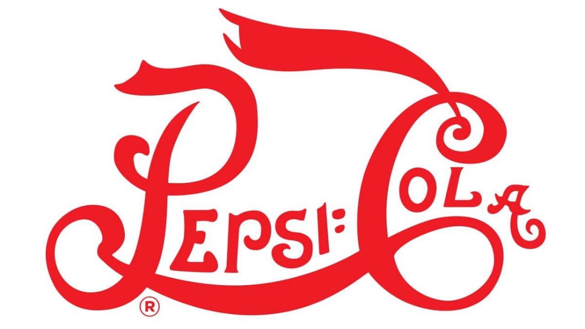
1898 – 1905
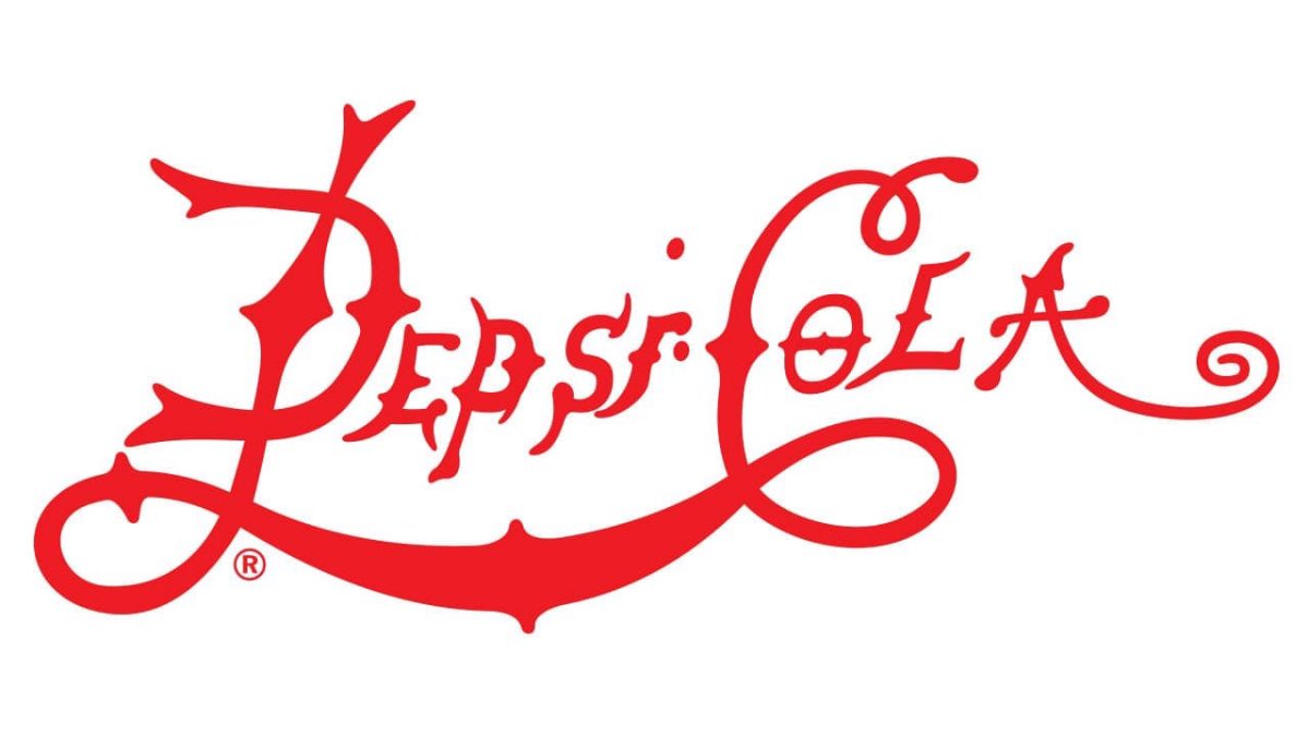
It was at this time that the Pepsi-Cola name was acquired and a new logo was designed, with red cursive lettering.
1905 – 1906
In this redesign, the visual identity was somewhat reminiscent of that of its main competitor, Coca-Cola.
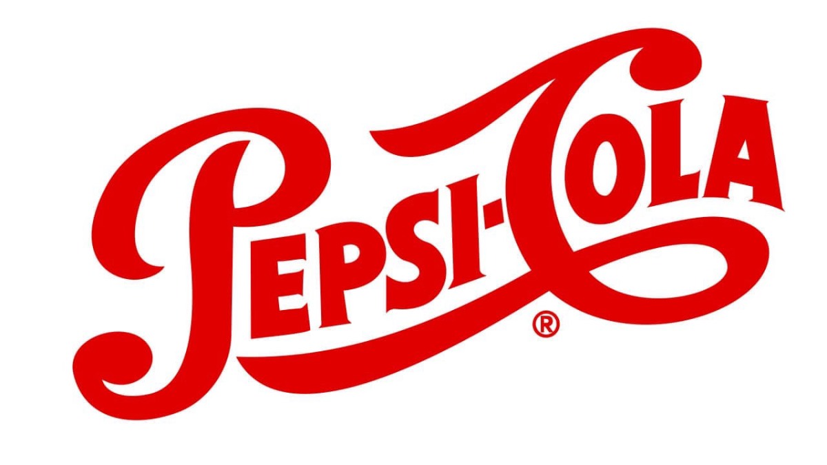
1906 – 1940
Similar to the previous one, but they introduced the inscription “Drink” and used a thicker typeface.
1940 – 1962
A further step towards a more modern visual identity, while maintaining the essence used up to that point.
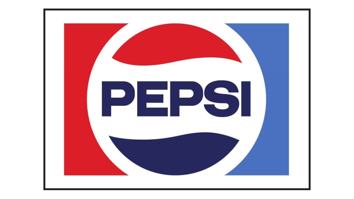
1950 – 1962
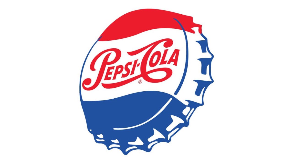
The visual identity was completely changed, introducing the bottle cap and also its iconic red, blue and white colours.
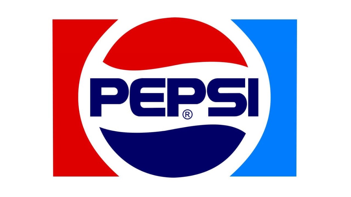
1962 – 1973
I change the view of the previous bottle cap, which served as a background to embed the Pepsi inscription.
1973 – 1987
They modernised their visual identity, changing the explicit bottle cap for a sphere that still symbolised the same element, but with a thick white outline within a red and blue rectangle.
1987 – 1991
They enlarged the lettering and removed the white frame from the logo.
1991 – 1997
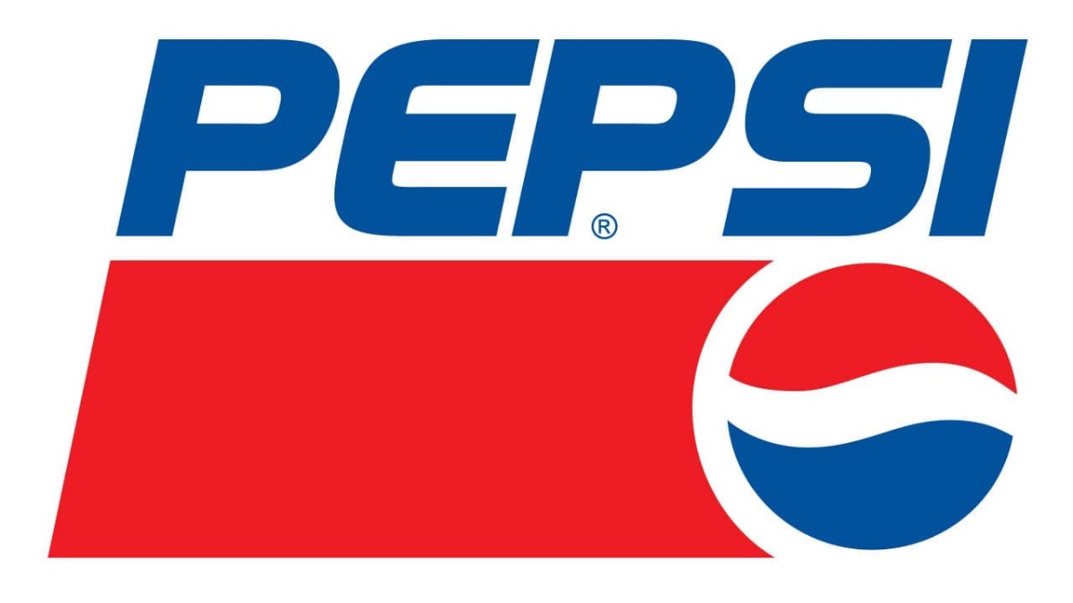
They decided to place the name outside the spherical emblem. And they also completely changed the composition, adding a red rectangle at the bottom next to the emblem.
1997 – 2003
They simplified their visual identity, leaving the letters in white and the three-dimensional emblem reminiscent of a globe.
2003 – 2006
The emblem was drawn in gradient colours and with a brighter appearance, as was the lettering.
2006 – 2008
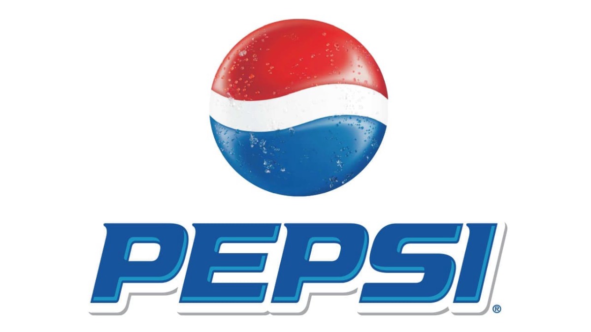
Here they decided to place the word mark under the spherical emblem, to which they added water droplet textures.
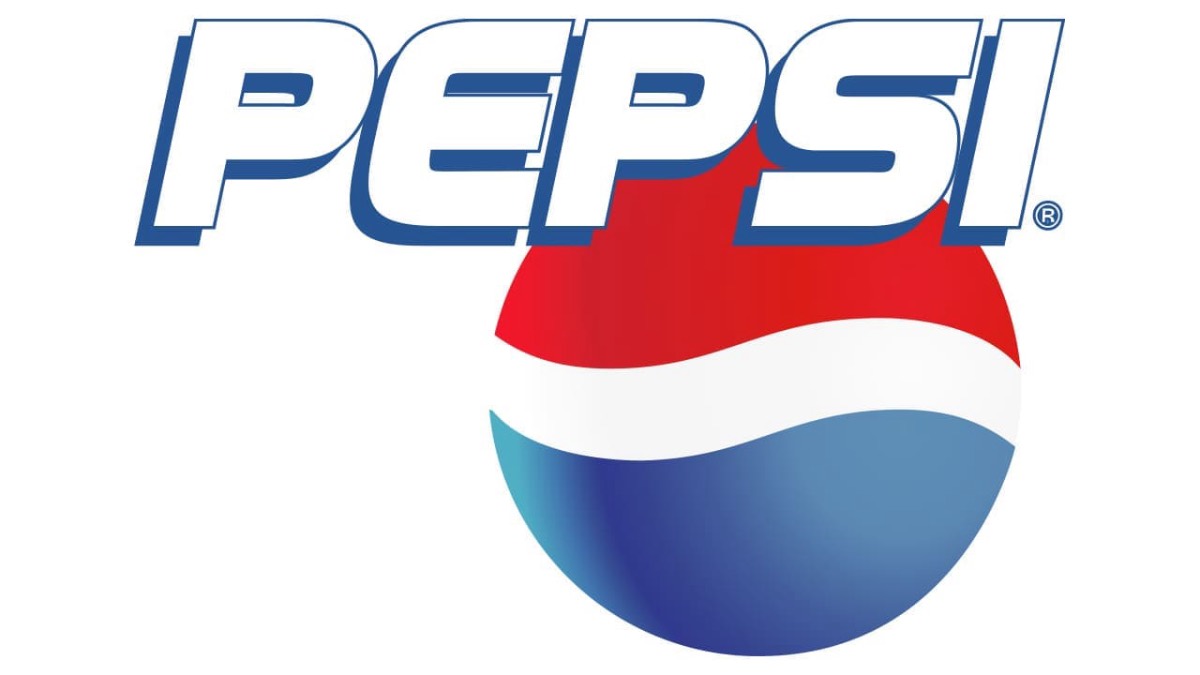
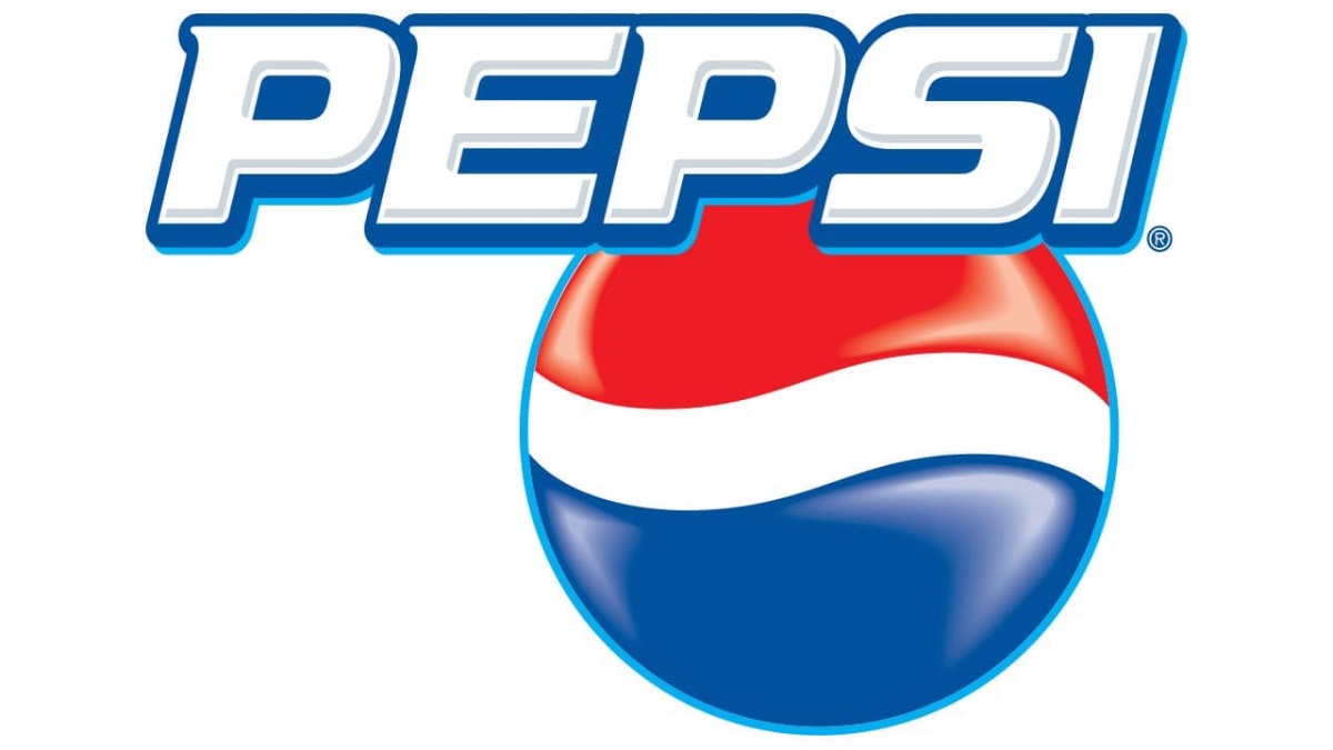
2008 – 2014
A completely new logo created in 2008.
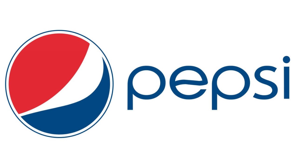
2014 – 2023
One of its more minimalist versions, with the emblem placed to the left of the word mark.